
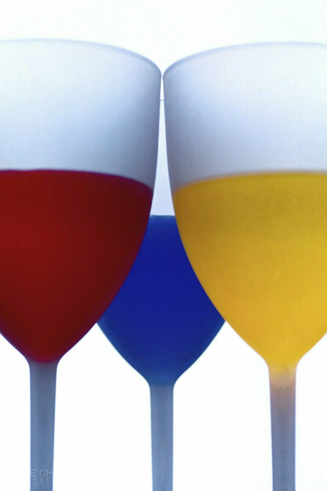
This image is one of the early creations of my photography career, when I was trying to apply the concept of color.
How to use color to communicate mood; for example, a large area of cold tone, then add a touch of warm tone, will enhance the visual effect of contrast.
A purely cold hue picture gives a melancholy, unhappy feeling, like a gloomy winter morning. On the other hand, a warm color scene, such as orange at sunset, will present a warm and cozy experience.
This kind of knowledge has made me very interested in the application of color.
However, I must start with the basics; for instance, how to photograph several contrasting colors, then observe what effect these colors will have when placed together.
When I went to the store and saw these three lovely plastic cups, I thought, this would be a good experiment.
I decided to shoot using backlighting. My humble studio had a large window which provided a good source of light.
I mixed dye and water to get the desired color. The cups were on the table, and the liquid was illuminated. I experimented with the order of placement, placing the different colors left and right in front and behind. It was found that blue would have a smoother feel in the back. Slightly lighter shades are appropriate to be placed in front.
I also experimented with different apertures to see how it affected the sharpness of the subject.
Later, when I ventured into Conceptual photography, and portraiture photography, this knowledge helped a great deal to achieve better results.
When I look back now and see the techniques I learned then, the basics are still one of the most important parts of any composition.